
Choosing the right color combination for your living room isn’t just about aesthetics—it’s about creating a space where you feel comfortable, relaxed, and at home. Whether you want something bold and modern, soft and serene, or timeless and classic, the colors you choose will set the tone for everything that follows.
The good news? You don’t have to be an interior designer to pull off a stunning palette. With the right pairings and a little inspiration, you can easily breathe new life into your living room.
Here are some of the best living room color combinations to consider—and why they work so well.
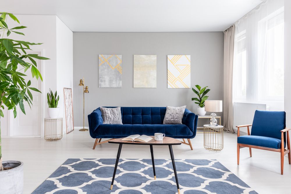
1. Navy Blue and Soft Gray
Why it works: Navy brings a rich, elegant feel to a room, while soft gray keeps things balanced and relaxed. Together, they strike a perfect harmony between bold and neutral.
How to use it:
-
Paint an accent wall in navy and use gray for the sofa or rugs.
-
Add brushed metal accents (like gold or silver) to elevate the look.
-
Layer with white or cream cushions for added lightness.
Best for: Modern or transitional spaces that want a touch of sophistication.
2. Sage Green and Cream
Why it works: Sage green is calming, earthy, and versatile. Paired with cream, it creates a soft, welcoming space that still feels fresh and current.
How to use it:
-
Use sage for the walls and cream for the trim and furniture.
-
Add woven textures, wooden accents, or terracotta planters for a cozy, organic vibe.
-
Works beautifully with plants and natural lighting.
Best for: Minimalist, Scandinavian, or cottage-style living rooms.
3. Charcoal and Blush Pink
Why it works: Charcoal brings depth and a touch of drama, while blush adds warmth and softness. It’s a high-contrast pairing that still feels refined and comfortable.
How to use it:
-
Opt for charcoal sofas or rugs and blush accents through throw pillows, artwork, or drapery.
-
Metallic touches (rose gold or brass) help tie the palette together.
-
Add a neutral like ivory or light beige to balance the tones.
Best for: Glamorous, romantic, or feminine-inspired spaces.
4. Terracotta and Ivory
Why it works: Terracotta brings in warmth, energy, and rustic charm. Paired with ivory, it creates a grounded yet breezy atmosphere—perfect for both modern and traditional styles.
How to use it:
-
Use terracotta for accent walls, pottery, or a feature chair.
-
Keep larger pieces like sofas, curtains, or rugs in soft ivory tones.
-
Pair with dark wood or black for contrast.
Best for: Boho, Mediterranean, or earth-toned interiors.
5. White and Olive Green
Why it works: Olive green adds a mature, natural vibe, while white keeps the space bright and airy. It’s a timeless combo that brings the outdoors in.
How to use it:
-
Olive green works great on cabinetry, built-ins, or accent walls.
-
Use crisp or warm whites on the walls, ceiling, or furniture.
-
Introduce subtle black hardware or matte metal finishes for definition.
Best for: Farmhouse, rustic, or traditional living rooms.
6. Taupe and Soft Blue
Why it works: Taupe offers a neutral backdrop that feels more interesting than standard beige, and when paired with soft blue, it adds serenity without being too cold.
How to use it:
-
Paint the walls taupe and bring in soft blue through throw pillows, vases, or upholstery.
-
Use lighter woods and white trim to tie the look together.
-
Incorporate some subtle patterns like florals or soft stripes.
Best for: Coastal, cottagecore, or classic interiors.
7. Black and White with a Pop of Color
Why it works: Black and white is timeless and versatile. Add one vibrant hue—like mustard yellow, emerald green, or deep teal—and you instantly create energy and interest.
How to use it:
-
Keep walls white and use black for trim, light fixtures, or furniture legs.
-
Add color through art, cushions, or an area rug.
-
Choose one bold shade and repeat it strategically throughout the space.
Best for: Contemporary, eclectic, or artistic spaces.
8. Greige and Dusty Rose
Why it works: Greige (a mix of gray and beige) is a modern neutral that pairs beautifully with muted, romantic tones like dusty rose.
How to use it:
-
Use greige as the base (walls, larger furniture), and add dusty rose for warmth.
-
Incorporate soft textures—velvet, linen, or boucle—for depth.
-
Add whites or creams to lighten the palette and prevent it from feeling too heavy.
Best for: Feminine, vintage-inspired, or transitional rooms.
9. Mustard Yellow and Deep Teal
Why it works: Mustard and teal are both rich, saturated colors that surprisingly complement each other. The combo feels fresh, bold, and full of personality.
How to use it:
-
Use teal on a wall or sofa and mustard in cushions, throws, or art.
-
Keep the rest of the room neutral (think warm whites or oak wood tones).
-
A patterned rug or bold artwork can help bridge the two colors.
Best for: Mid-century modern, bohemian, or eclectic living rooms.
10. Beige and Forest Green
Why it works: Beige softens the strength of forest green, while forest green adds mood and character to beige. It’s a nature-inspired combo that feels grounded and timeless.
How to use it:
-
Use beige for walls or seating and green for accents like curtains, armchairs, or planters.
-
Layer with natural textures—jute, rattan, or stone.
-
Metallics in bronze or aged brass add a rustic polish.
Best for: Classic, rustic-modern, or vintage-inspired spaces.
Tips for Choosing the Right Color Combo
While there’s no one-size-fits-all formula, here are a few tips to help you find the right combination for your home:
1. Start with What You Love
Look at your favorite decor items—art, textiles, furniture—and see which colors you’re naturally drawn to. Let that guide your base palette.
2. Use the 60-30-10 Rule
Use your primary color for 60% of the room (walls, rugs), a secondary color for 30% (upholstery, drapes), and an accent color for 10% (pillows, decor).
3. Test Samples First
Colors can look very different depending on the light in your room. Always test swatches on your walls before committing.
4. Balance Warm and Cool Tones
Too many cool tones can feel stark, and too many warm tones can feel heavy. Aim for a blend to keep things balanced.
5. Don’t Forget Texture
Color isn’t just about hue—texture and material (matte, shiny, rough, smooth) also impact how colors are perceived and how the room feels overall.